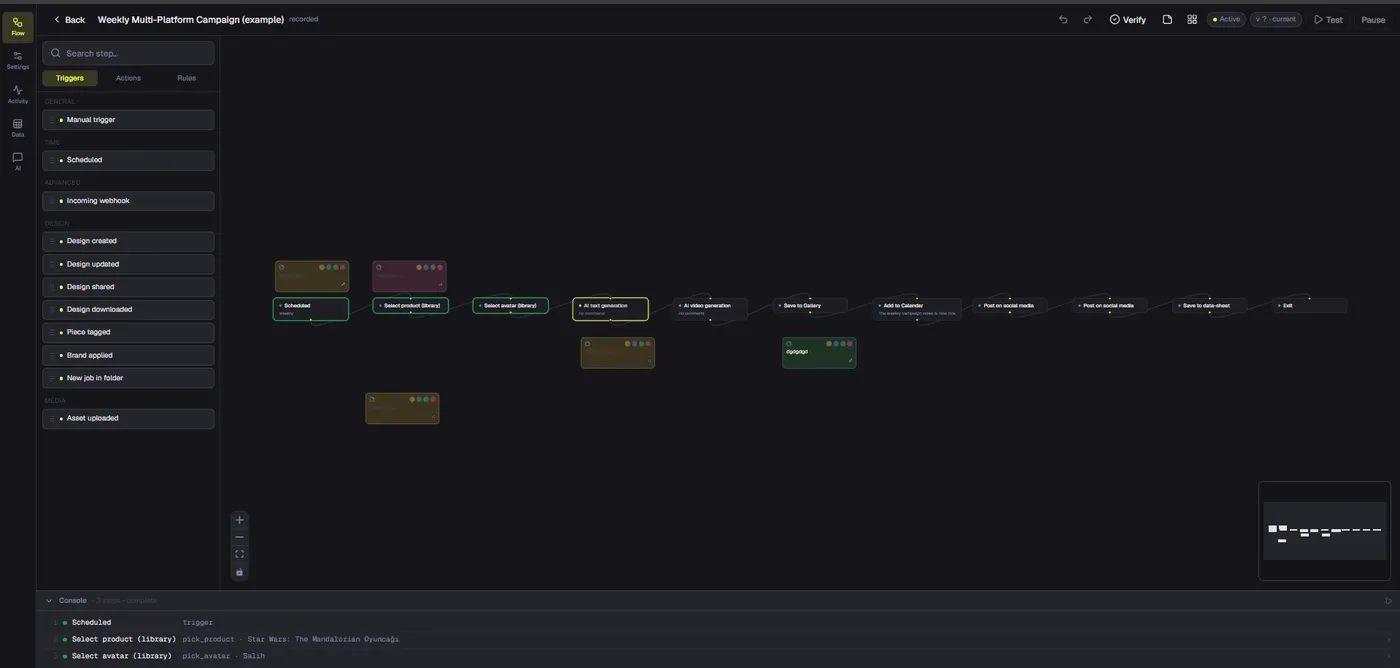
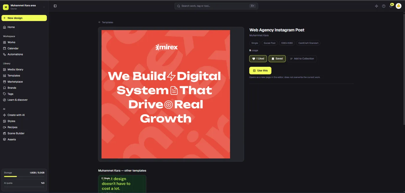
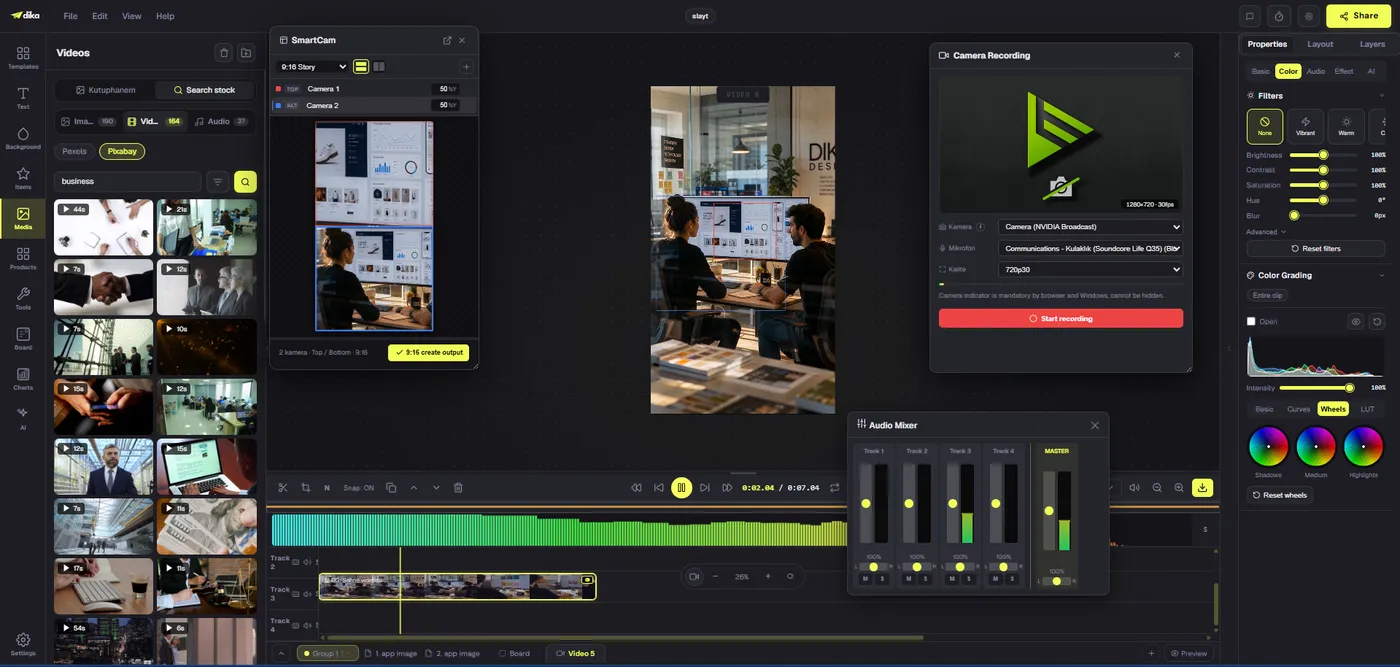
Social media design templates turn repeated publishing tasks into consistent, editable starting points. The goal is not to make every post identical. It is to preserve brand rules and content hierarchy while changing the message, image, and format appropriately. This guide shows how to define useful templates, test them with real copy, save editable masters, and maintain a small library without losing quality.
Define the template’s job before opening an editor
Social media design templates work best when each one serves a repeatable communication task. A product announcement, testimonial, educational tip, sale reminder, and event update do not need identical hierarchy. Write a one-sentence brief for each recurring format: audience, primary message, required action, channel, and what changes from post to post. That brief becomes the standard against which the template is tested.
Inventory your last twenty posts. Group them by purpose rather than by color or shape. If twelve posts share the same structure but different headlines and images, they are a strong template candidate. If a format appeared once for a special launch, making a reusable template may add maintenance without saving time. Start with two or three high-frequency formats; expand only when real publishing patterns justify it.
Separate fixed and variable elements. Fixed elements might include logo position, color roles, margins, typographic scale, and a standard footer. Variable elements might include headline, product image, date, price, and call to action. If this boundary is unclear, people will either freeze content that must change or accidentally edit the system that creates consistency.
Build from brand rules, not a decorative starting point
Collect approved marks, colors, fonts, photography treatment, and voice examples before designing. A visually attractive preset is not necessarily a useful brand template. It may conflict with required logo spacing, accessible contrast, or the way your product is photographed. Use the brand kit as a reference, then select a starting design only if its composition supports the message.
Create a simple grid. Decide outer safe margins, headline area, image area, and logo or attribution zone. Choose spacing relationships that survive short and long copy. A template should handle realistic extremes: a five-word headline, a two-line headline, a square product image, and a portrait photograph. If one variation breaks it immediately, you have created a mockup rather than a reusable system.
In Dika Studio, the editor’s Post template mode includes categories such as Social Post, Story, and Banner. Applying a template creates editable objects on a canvas, so the designer can change text, colors, images, and layout. That makes a built-in template a starting point, not proof that it already matches your brand. Restyle and test it before turning it into a repeatable house format.
Create a small family instead of one universal layout
A universal social media template often forces every message into the same visual rhythm. That can make an educational carousel feel like a product ad or a customer quote look like an event invitation. Instead, create a family with shared typography, palette, logo treatment, and spacing, but distinct information structures. The posts should feel related without being duplicates.
An effective first family might contain an announcement card, a benefit explainer, a quote or proof point, and a visual-led product card. Give each a clear content specification. For example, the quote card might support one quote up to thirty words, a name, and an attribution line. If copy runs longer, the editor should know to shorten the quote rather than shrink the font below legible size.
Keep the number of formats manageable. Every template creates a maintenance obligation when the brand changes. Four reliable layouts are more valuable than thirty partially checked ones. Document when to use each format and show one approved example; people should not have to infer the purpose from its thumbnail alone.
Use hierarchy that survives fast scrolling
A social post has little time to communicate its point. Give the viewer one dominant message, then a supporting cue, then brand context. Decide whether the headline or image carries the first impression. Do not give a headline, badge, logo, discount, and call to action equal visual weight. A template should make priority obvious even after the specific content changes.
Test text with genuine editorial samples. Placeholder copy often conceals failure. Insert a realistic long product name, a short benefit, a number with a unit, and a legal qualifier where needed. Check how the layout behaves. If text overlaps the subject or collapses the margin, revise the grid before saving the template. Avoid solving every stress test by making type smaller.
Accessibility matters at the template level. Ensure text-background contrast is sufficient for the chosen color pair, avoid relying on color alone to indicate meaning, and leave room for meaningful alt text in the publishing workflow. Template consistency should not repeatedly reproduce an unreadable design. Review at phone scale, not only on a large editor canvas.
Design image slots for actual content
An image slot should specify subject placement and crop tolerance. If the template puts text on the left, a photograph with the product on the left may compete with it. Define the preferred focal area and a fallback layout when the source image cannot be cropped safely. Product imagery, people, and interface screenshots have different needs; one masking style will not suit all three.
Keep imagery guidance more precise than use high-quality photos. State acceptable source and rights, preferred background, lighting or treatment, minimum resolution, and what should never be covered by typography. If the team makes software content, a real interface capture may be more credible than generic office photography. If the message depends on a feature, show that feature accurately rather than using an unrelated screen.
Do not stretch images to fit a box. Preserve their aspect ratio and crop deliberately. Preview exported output for blurriness and accidental focal-point loss. These checks are especially important when one layout will be reused by contributors who did not create the original design.
Construct an editable master in the canvas
Build the master with separate objects for headline, supporting copy, brand mark, image, shapes, and small labels. Editable objects allow controlled variation later. Avoid flattening the entire post into one image if the team needs to revise prices, dates, or translations. Name or group elements coherently if the editor supports it, and keep alignment relationships intentional.
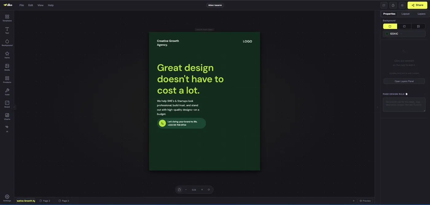
Dika Studio’s visible design editor presents a canvas with object, properties, layout, and layers controls. Use those controls to check the master with more than one content sample. A layout that looks polished for one campaign might fail after the second headline or another crop. Make adjustments to the master before it becomes everyone’s shortcut.
Distinguish the design master from an exported post. Exported PNG or JPG is a delivery artifact. The editable source is the reusable template candidate. Retain both when necessary, but do not ask teammates to rebuild an editable layout from a flattened social graphic just because the source was not saved.
Test variants before saving as a reusable template
Run at least three substitutions: short headline with simple image, long headline with busy image, and a version with mandatory extra detail such as date or price. Check margins, line breaks, emphasis, contrast, and logo prominence. If one case requires a different composition, create a sibling template rather than hiding many exceptions in one file.
Have someone else perform the test. They should be able to identify what may change, what should remain fixed, and where the approved image belongs without asking the designer. A template that only its creator can operate is not yet ready for a team. Record the confusion they encounter; it will be more informative than asking whether the layout looks good.
Export samples at intended size and inspect them outside the editor. Social feeds, stories, and ad placements can crop or overlay interface elements differently. Platform specifications can change, so verify current channel requirements before release. The template’s role is to reduce repeat work, not to eliminate final placement checks.
Save, name, and back up templates carefully
Use names based on purpose and format, such as Product Announcement Square or Customer Quote Story. Add a version or review date if multiple approved generations coexist. Avoid final-final naming: it becomes impossible to identify the authoritative copy. Include a short usage note nearby with maximum headline length, image treatment, and optional elements.
Dika Studio lets creators save a design as a template and reopen it from My Templates. Its documentation states these personal saved templates are stored in that browser’s local storage. They survive a reload but do not automatically follow the user to a different browser or computer. Export the template as JSON if you need an independent copy or transfer. Clearing browser data without a backup can remove local saves.
This limitation matters for team planning. A personal My Templates library should not be treated as a centrally synchronized team library unless that behavior has been separately verified. Maintain a shared record of approved formats and export backups under the brand owner’s control. Community sharing is a separate workflow with its own consent and moderation implications, not a substitute for internal approval.
Adapt templates to channels rather than blindly resizing
A square post, a vertical story, and a wide banner ask for different visual priorities. Start from the same brand system but create format-specific compositions. In a vertical story, the subject and headline may need a top-to-bottom sequence; in a wide banner, whitespace can separate message and product. Blindly scaling every object preserves dimensions mathematically while damaging hierarchy.
Decide which message elements must survive every format and which are optional. The core promise, product identity, and necessary disclosure may be nonnegotiable. Supporting copy may move to the caption or be removed from a narrow composition. Record those rules so adaptation is not a series of ad hoc decisions under deadline.
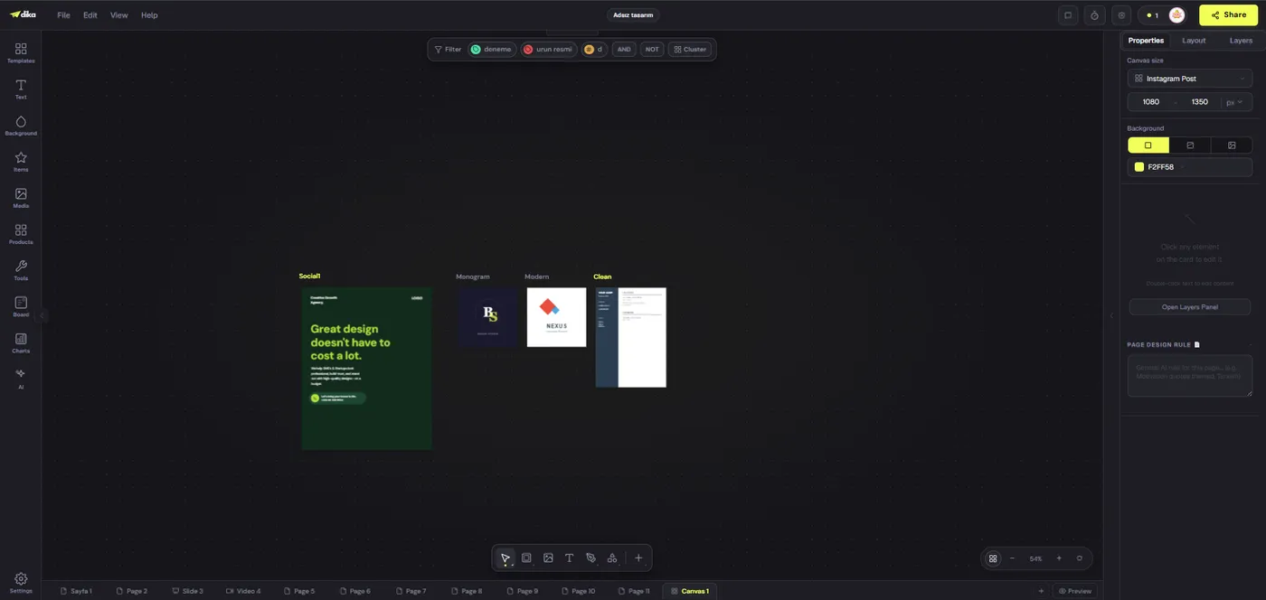
An infinite canvas can help compare pages side by side. Dika Studio shows multiple design pages in its canvas view, allowing visual inspection of a family of variants. That view does not mean a layout automatically becomes production-ready for every size. Check each version in its own export and publishing context before it goes live.
Set a lightweight review and ownership loop
A brand owner should approve the master template and decide when it changes. Content contributors should be able to populate approved fields without redesigning the system. When they encounter a legitimate exception, they should flag it instead of quietly changing the master. This division keeps reusable patterns reliable and leaves room for judgment.
Review two things separately: content accuracy and design consistency. A post can be perfectly on-brand but factually wrong. Another can state facts correctly while using an outdated logo. Use a short checklist that covers claims, links, rights, dates, readability, and identity. For time-sensitive content, identify who makes the final call when an exception is needed.
Do not imply that a saved template automatically enforces brand rules. It supplies a controlled starting point, but elements remain editable and reviewers remain responsible. That flexibility is valuable when legitimate channel differences arise, yet it requires clear ownership and routine quality checks.
Maintain a template library without clutter
Review library use after several weeks. Identify layouts that are repeatedly chosen, layouts that require heavy edits every time, and layouts that no one selects. A heavily edited layout may have the wrong purpose or too narrow a content model. A rarely used layout may be a special campaign artifact rather than a template. Archive or relabel accordingly.
When identity rules change, update the master and retire the old version. Do not silently leave both active with nearly identical names. If past work must remain accessible, label it historical. The goal is not to erase design history; it is to prevent a contributor from picking yesterday’s brand rules for tomorrow’s launch.
Keep backups of important editable sources. If a tool stores personal templates in browser storage, export them before clearing data, changing devices, or handing work to another person. A sustainable template library includes ownership, versioning, rights, and recovery, not only thumbnails.
Compare template routes against your real workflow
There are three common starting routes: build a layout from scratch, adapt a built-in template, or reuse a saved brand master. Building from scratch offers maximum control but costs time. A built-in layout can speed up exploration but needs brand and content checks. A saved master is usually fastest for repeated work, provided it was stress-tested and remains current.
Compare routes with the same task. Ask a contributor to make an event announcement and a product benefit post using each route. Record setup time, number of corrections, and final quality. Do not choose a route because its first draft looks polished; choose it because its fifth use is still efficient and accurate.
The comparison table below summarizes useful tradeoffs. It does not rank vendors. A team with one seasonal campaign may prefer flexible one-off design; a team publishing daily needs a repeatable system. Your publishing volume, number of brands, and revision frequency determine how much formal template management is worth.
Three routes to a reusable social design
| Route | Best use | Main risk | Validation |
|---|---|---|---|
| Start from scratch | Unusual one-off message | Slow repeated production | Check identity and channel output |
| Adapt built-in layout | Fast concept exploration | Generic look or poor brand fit | Restyle and stress-test content |
| Reuse saved brand master | Frequent recurring format | Stale rules or rigid content slots | Review version and real substitutions |
A practical first week for social media design templates
On day one, inventory repeated content types and collect approved brand assets. On day two, choose two template candidates and write content rules for each. On day three, build masters with editable objects and real copy. On day four, ask another person to replace copy and imagery, then fix failures they found. On day five, export channel variants and approve the library with a named owner.
During the first two weeks of use, keep a log of exceptions. Note when text was too long, a photo crop failed, a call to action needed another position, or a channel safe area interfered with the layout. Treat these as evidence about the template system, not as mistakes by individual contributors. A good system becomes more usable after contact with real content.
The first goal is a reliable repeatable path, not a giant design library. Two tested masters can improve throughput more than twenty unvalidated files. Once they work, add another format based on actual demand. That sequence protects both brand consistency and production speed.
What to do next
Select one recurring post type and write its content specification. Build an editable master, test at least three realistic substitutions, and export the result for the intended channel. Save the master with a clear purpose name, record its owner, and back it up. Then repeat for another content type only when the first template has survived real use.
For the source-versus-export distinction, read our guide to editable designs and flat images. Explore the Dika Studio workspace to assess its editable canvas and template workflow. Keep the decision grounded in work your team actually publishes.
Frequently asked questions
What is a social media design template?
It is an editable starting layout for a repeatable post type. It preserves chosen brand and hierarchy decisions while allowing content, images, and channel-specific details to change.
How many templates should a small team start with?
Start with two or three frequent formats. Test them with real content and add more only when publishing patterns justify the maintenance.
Should every social post use the same template?
No. Create a small family with shared identity rules but different information structures for announcements, education, proof points, and product visuals.
Can a flattened image work as a reusable template?
It may work as a visual reference, but an editable source is better when people must change text, imagery, or layout without rebuilding the design.
How should I test a template?
Replace placeholder content with short and long headlines, busy and simple images, and mandatory details. Export and inspect at actual channel size.
Does Dika Studio offer editable social templates?
Its editor documentation describes Post templates including Social Post, Story, and Banner categories. Applied templates contain editable canvas objects that can be customized.
Where does Dika Studio save My Templates?
The documented My Templates collection is saved in that browser’s local storage. Export templates as JSON for backup or transfer to another browser or computer.
Will one template automatically resize for every social channel?
Do not assume so. Adapt the composition for each destination and verify the final export, crop, text legibility, and safe areas.
How do I keep a template library current?
Assign an owner, label versions clearly, retire obsolete layouts, review actual usage, and back up editable masters.
What is the difference between a brand kit and a design template?
A brand kit stores identity assets and guidance. A design template arranges that identity into a repeatable layout for a particular communication task.