Video ad sizes for Instagram, TikTok, and YouTube depend on placement, not just platform name. A vertical Reel, TikTok in-feed ad, YouTube Short, and horizontal YouTube video can share one campaign idea but need different framing and checks. This guide separates ratio from resolution, gives practical working dimensions, and shows how to protect important information from platform overlays.
Dika Studio can assemble and export ratio-specific MP4 video from a browser timeline. That does not replace checking each ad manager’s current requirements and preview. Build the story first, adapt it for the placements you buy, then verify the delivered file and its actual appearance.
Why ad size begins with placement
A video ad does not have one universal size. Instagram Reels, TikTok in-feed, YouTube Shorts, and horizontal YouTube inventory present different viewing spaces. Start with the exact placement and ad type in the media plan. A 9:16 file can be accepted in a system yet still be cropped, letterboxed, or covered by interface controls in the selected placement. Record ratio, resolution, duration, file type, landing page, and reviewer for every version before an editor starts resizing anything.
Separate aspect ratio from resolution. Ratio describes shape, such as 9:16 vertical or 16:9 horizontal. Resolution describes pixels, such as 1080 by 1920. Safe area describes where important words and product details remain visible after captions, account information, buttons, or calls to action appear. Meeting a pixel recommendation does not guarantee a usable ad. Use the platform’s current preview and safe-zone tools as the final test, because interfaces and requirements change.
Write a delivery matrix for the actual campaign. If the plan only buys vertical inventory, a vertical master may be enough. If the plan includes horizontal YouTube ads, make a purpose-built wide cut. Avoid paying for a collection of sizes no one will use, and avoid relying on automatic crops for important claims.
Working dimensions for Instagram, TikTok, and YouTube
A practical vertical production canvas is 1080 by 1920 pixels at 9:16 for Instagram Reels, TikTok in-feed, and YouTube Shorts. Meta’s Reels guidance emphasizes vertical video, sound, and key messages inside the safe area. TikTok recommends vertical 9:16 for in-feed auction ads; its published minimum for some non-Spark ads is below 1080 by 1920, so this Full HD size is a working target, not a universal legal minimum. Google recommends 9:16 for Shorts and lists 1080 by 1920 as a Full HD vertical example.
For a horizontal YouTube video ad, 1920 by 1080 at 16:9 is a useful Full HD master. Google also recognizes 1080 by 1080 square video in some campaign contexts. The exact duration and accepted format depend on the ad product, campaign type, and sometimes the country. Confirm the current specifications when the ad is uploaded rather than relying on an old reference sheet.
Think of these dimensions as starting canvases. Export at the chosen size, then preview the actual placement. If an automatic variation cuts off the product or covers the offer, create a tailored version. Technical acceptance is not the same as editorial approval.
| Placement | Working ratio | Common Full HD canvas | Check |
|---|---|---|---|
| Instagram Reels | 9:16 | 1080 x 1920 | Meta safe zone and preview |
| TikTok in-feed | 9:16 | 1080 x 1920 | Ad type and controls |
| YouTube Shorts | 9:16 | 1080 x 1920 | Shorts preview |
| YouTube horizontal | 16:9 | 1920 x 1080 | Wide player readability |
| Square variant | 1:1 | 1080 x 1080 | Placement support |
Instagram Reels: leave room for the interface
A vertical Reel fills a phone, but the viewer does not see only your video file. Account details, platform captions, reaction controls, and a call-to-action area can compete with your own text. Keep the product, offer, and essential proof away from the edges most likely to be covered. There is no magic margin that stays correct for every device and interface revision. Use Meta’s latest safe-zone checker and the preview for the placement you selected.
Build the opening frame to work with sound and without it. Audio can add emotion, but the product or problem should be legible before a viewer decides whether to continue. Make captions large enough for a phone and do not place a price or date only in tiny text. A sharp 1080 by 1920 MP4 can still fail if its key message becomes unreadable at real viewing size.
If the campaign also uses Instagram feed placements, inspect those separately. Repositioning a title may be enough for one feed crop; another may need a different close-up. The last frame should match the landing page’s current offer. Avoid a beautiful Reel that promises a product color or discount the linked page cannot provide.
TikTok in-feed: choose the correct ad type
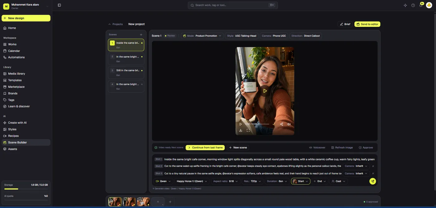
TikTok’s vertical 9:16 direction is a way to use the phone screen, not a request to fill every edge with copy. Leave room for platform controls and make the subject clear early. If the first seconds are an empty logo animation, the viewer may leave before seeing the product. A real action, objection, or product detail often earns attention more efficiently than decorative movement.
Record whether the campaign uses Spark or non-Spark ads. A Spark ad may pull from an existing post; non-Spark uploads follow a separate specification. Duration and caption behavior are not identical across these workflows. Recheck Ads Manager after the campaign type is chosen. Keep export source files so an editor can respond to a rejection without rebuilding the campaign from scratch.
Inspect the mobile preview with sound and muted. Do the subtitles remain legible? Does a button cover the product? Does a generated scene imply a physical feature the product lacks? A correct ratio cannot make a misleading shot acceptable. Prefer real demonstration when the ad makes a factual performance claim.
YouTube Shorts and horizontal ads are different cuts
Google recommends vertical 9:16 for Shorts, while a horizontal 16:9 version is useful for wide video inventory. A vertical asset may be accepted in more contexts, and automated systems can create alternate crops, but acceptance alone does not protect composition. Give the Shorts version a strong early proof moment and enough room for interface overlays. Give the horizontal version readable product or screen detail rather than padding a vertical clip with blurred sidebars.
Google’s Full HD examples include 1080 by 1920 vertical, 1920 by 1080 horizontal, and 1080 by 1080 square. Video length depends on the format and campaign type. Do not copy one maximum duration into all YouTube briefs. Build the campaign, inspect its format-specific requirements, and preview every selected placement. If an automatic variant changes the framing, review what actually serves.
A tutorial-style product ad may benefit from a wide real screen recording. A quick consumer product tease may be clearer in a vertical crop. Let the buyer question and placement decide. The video should show the same truthful claim in both cuts even if shot order and text position change.
Create one approved story before three exports
Approve the message, product proof, and call to action before multiplying formats. Write a short shot list that says what each scene proves and where its source came from. Mark real product footage, approved stills, interface captures, and generated concept scenes separately. If a claim survives in the vertical cut but its proof disappears during a horizontal reframe, the new version is not ready.
Make a first rough cut in the primary placement. Review the first frame, proof moment, and final action. Then adapt the composition for other placements that will actually be bought. A vertical cut may need a closer product shot, while a horizontal cut may need contextual footage or a clearer screen demonstration. Do not mechanically center every crop; follow the action the viewer must understand.
Keep narration and claim wording consistent between versions. If the offer or product feature changes, update all files, captions, and landing pages together. Name versions by channel, ratio, language, and revision so an old export cannot masquerade as the approved final. A small set of correctly governed variations beats many unused files.
Use Dika Studio’s ratio-specific MP4 export
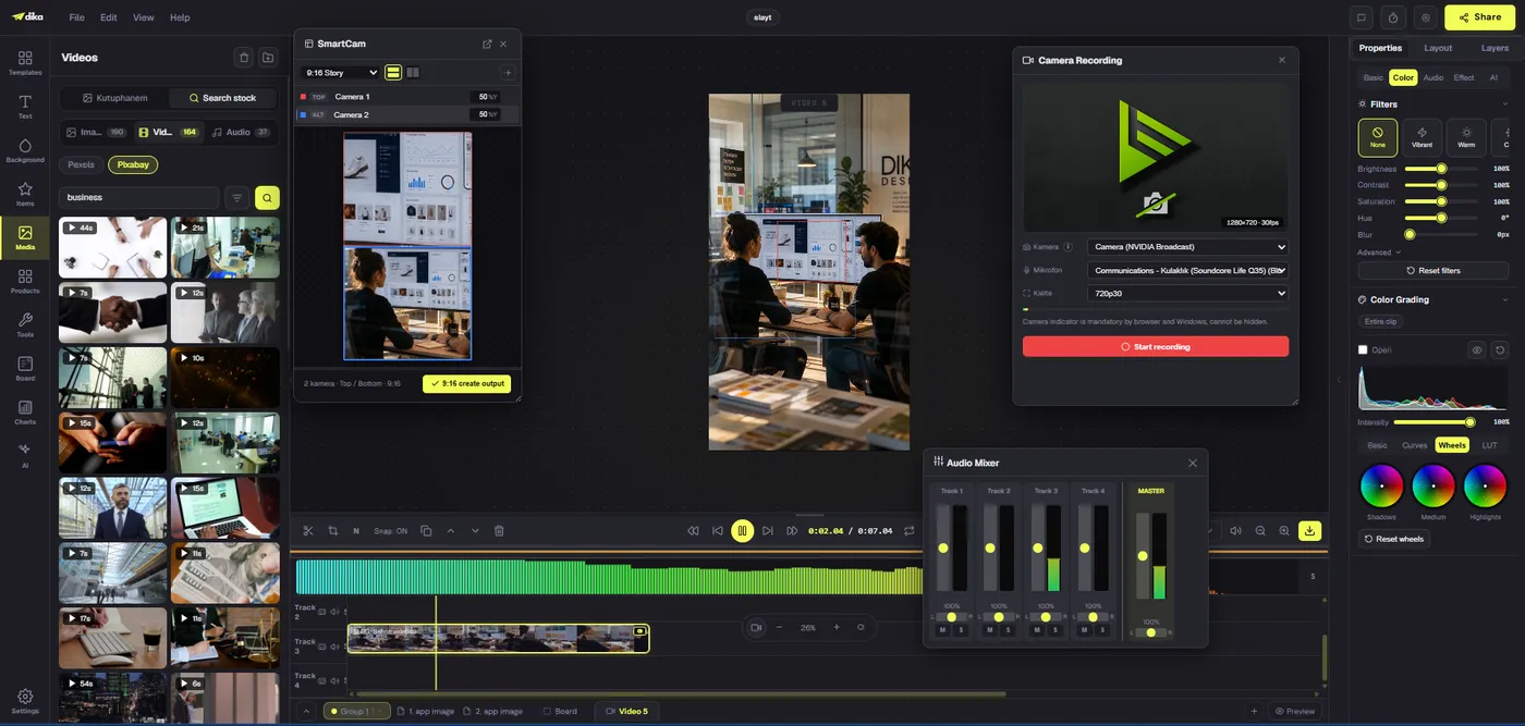
Dika Studio’s browser editor provides a multitrack timeline and a reliable MP4 (H.264) video export. The export dialog allows selection of resolution, aspect ratio, frame rate, quality, audio, and timeline range. Its ratio choices include 16:9, 9:16, and 1:1. A 9:16 export with the 1080p preset produces 1080 by 1920 pixels. Thirty frames per second is a practical default for many short social videos, but the footage and destination may justify another choice.
Do not assume an empty platform-preset step configures everything for you. Choose the actual settings, inspect the summary, and export a short draft range if you need to test a crop. When the full file downloads, play that MP4. Check for black frames, clipped type, wrong captions, and missing sound. The editor preview is not the delivery file. If a browser audio encoder fails, a video can export without audio, so playback verification is essential.
Keep footage, captions, music, and voice on separate tracks where possible. When a platform version needs a different crop, separate layers make it easier to move text and proof shots without recreating the sequence. Recheck every caption after timing changes. A successful export is only one step; the ad-manager preview is still required.
Safe zones need inspection, not a memorized margin
Platform overlays move. A fixed top or bottom percentage copied from an old template can be wrong for a new ad product. Place essential information near the visual center, keep decorative elements toward edges, and inspect the latest placement preview. Look at the hardest frame, not only the first. A lower-third offer might look fine during the hook and become covered by a call-to-action button near the end.
Subtitles can grow to two or three lines when automatic transcription groups speech differently. Review them at real playback speed on a phone. If the text forces a buyer to pause the ad to understand it, simplify it. A product interface with small labels may need a closer crop or a separate cut. Adding more caption text over a tiny screen usually makes both less readable.
Mandatory disclosures should remain legible and adequate for the market; being technically present is not enough. Use the platform’s current safe-zone checker where available. Keep screenshots from the preview with the approval record so reviewers know what they signed off on, rather than approving a clean editor canvas they will never see in the actual placement.
Sound, captions, and length affect format quality
A video can fit 9:16 perfectly and still feel wrong in-feed. Design a visual opening that works muted, then use sound to strengthen it. Balance voice over music and verify rights for every audio asset. Dika Studio’s mixer provides per-track controls. Its subtitle tools can generate timed cues from clip audio or import SRT and VTT files. Automatic captions still need a human check for prices, names, numbers, and legal qualifications.
Do not make the ad as long as the platform allows simply because the upload accepts it. A concise product proof may need only a short sequence, while a complicated B2B workflow may require more explanation. Let the message determine duration, then confirm the chosen campaign’s requirements. Avoid repeating generic benefits to occupy seconds. Every scene should move the buyer toward understanding.
Check the final frame and destination. It should remain visible long enough to register, and the linked page should fulfill the promise. Localized versions need separate timing and caption checks. A translated line can be longer and cover a product detail even when the original English version stayed in its safe area.
Preflight every file and placement
For each export, record platform, ad type, ratio, pixel dimensions, format, language, revision, destination, and approver. Check the actual MP4 properties rather than trusting its filename. Watch the whole file on a phone and desktop. Then upload a test to the ad manager and inspect all selected placement previews. If the system produces alternate crops, review those before launch.
Technical checks are necessary but not sufficient. Compare the video with the current product and offer. Verify a price, model name, label, interface feature, and any performance claim. Generated scenes should not be presented as literal evidence of behavior they did not capture. Check rights for footage, music, voice, and customer material. A polished misleading video can cost more than a rejected file.
After launch, record placement-level results and viewer questions. If people watch but misunderstand the offer, the crop or story may be wrong. If viewers leave before the proof, move it earlier. Do not assume a larger file size fixes a weak opening. The goal is an ad that renders correctly and helps a buyer make a sound decision.
A production checklist that scales
Start with exact placements. Read current platform rules. Approve one message and one proof moment. Create the primary cut, then adapt only the additional ratios your media plan needs. Review product accuracy, subtitles, safe zones, audio, and final calls to action in each version. Export MP4, play the downloaded file, and inspect live ad-manager previews. Name and archive the approved files with their source project and reviewer.
This process lets a team reuse a campaign idea without pretending that one crop solves every channel. Dika Studio makes it practical to assemble and export versioned video in a browser, while the campaign owner still decides what the product can honestly claim. Explore our Dika Studio video workspace, the text-to-video ad workflow, and Dika home page for broader digital campaign work. Choose the format that serves the placement and the story, then verify what the platform actually displays.
Confirm current specifics in Meta Reels guidance, TikTok in-feed specifications, and Google video ad specifications before upload.
Frequently asked questions
What size should an Instagram Reels video ad be?
A 9:16 vertical production at 1080 by 1920 pixels is a practical target. Check Meta’s current placement preview and safe zone.
What size should a TikTok in-feed ad be?
Vertical 9:16 is recommended. A 1080 by 1920 master is common, but minimum specifications vary by ad type.
What size should a YouTube Shorts ad be?
Google recommends vertical 9:16 and lists 1080 by 1920 as a Full HD example.
What size works for horizontal YouTube ads?
A 16:9, 1920 by 1080 Full HD master is a practical starting point. Check the exact campaign format.
Can I use one video for all three platforms?
One story can be adapted, but inspect each crop, caption, safe area, and call to action before launch.
What is the difference between ratio and resolution?
Ratio is frame shape, such as 9:16. Resolution is pixel dimensions, such as 1080 by 1920.
What is a safe zone?
It is the area where key information stays visible after platform controls and overlays appear. Use current placement previews.
Does Dika Studio export vertical MP4?
Yes. Select 9:16 and 1080p for a vertical Full HD MP4 export, then replay the downloaded file.
Are square video ads useful?
They can be useful in supported placements, but they do not replace purpose-built vertical creative for Reels or Shorts.
How often should I recheck specifications?
Check whenever you build or revise a campaign, because platform rules and interfaces can change.