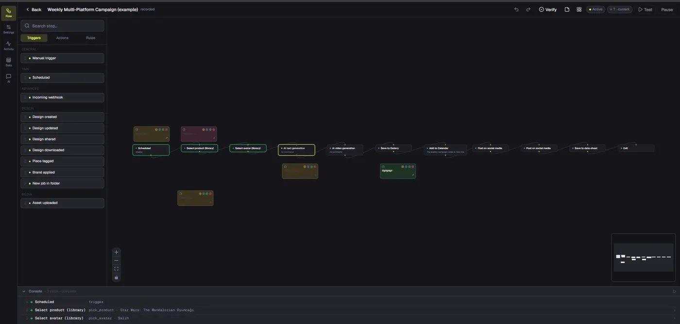
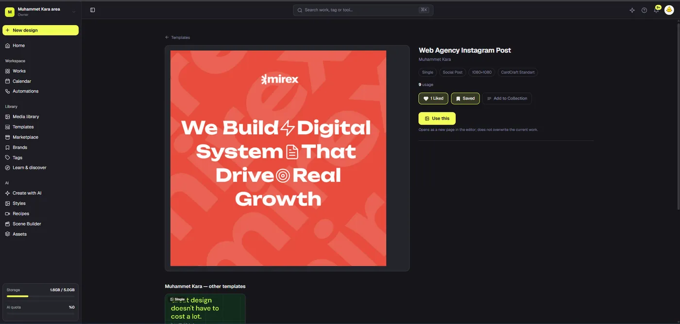
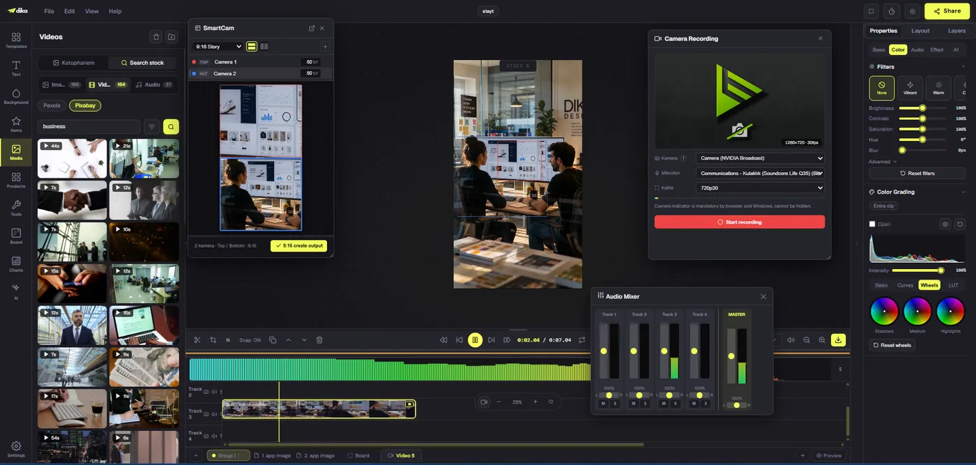
A campaign brief does not become a usable social asset merely because someone drops its headline into a template. The brief names a goal; production must turn that goal into a message, a visual system, platform variants, captions, approvals, and export files. This guide follows a practical example from first decision to ready-to-deliver social assets. Dika Studio provides editable pages, an infinite scene for related frames, shared media, and project parts that can keep the work connected. The workflow remains human-led: teams must verify product facts, usage rights, and channel requirements rather than treating generation or resizing as automatic approval.
Begin with a brief that supports decisions
A usable brief states audience, objective, offer, proof, channels, deadline, and constraints. For this example, imagine a fictional software company promoting a free live walkthrough of a new analytics workspace. The goal is qualified sign-ups, not general brand awareness. The audience is operations managers who struggle to reconcile weekly performance data. The offer is a live demonstration, not a claim that the software eliminates every reporting task. The proof available today is a product screen approved for public use and a short customer quote with permission. The channels are a square feed post, a vertical story, and a landscape professional-network post.
Write the action the audience should take: register for the walkthrough. Then decide what would make that action reasonable. A credible post might show one recognizable interface detail and explain the specific reporting problem the session will address. It should not invent a percentage improvement because the example brief has no measured result. Keep a claims list next to the brief: approved product name, permissible feature wording, date and time of the session, speaker names, and registration URL. This prevents copy changes from drifting into unsupported promises. The Dika Design approach</a connects that clarity of intent with design execution.
Translate the brief into one core message
A social campaign needs a message hierarchy before layout. The primary message may be “See how one weekly reporting view brings scattered updates together.” A supporting line can state what the walkthrough covers. The CTA should be short and exact: “Register for the live walkthrough.” Test this hierarchy against the brief. Does it answer the audience problem without implying a guaranteed outcome? Is the offer clear without the caption? Can the main idea fit into a small mobile preview? If not, refine it before making variants.
Draft three headline options and choose one based on clarity, not novelty. A team can use AI assistance to generate alternatives, but the final wording must preserve approved facts. Avoid stuffing multiple benefits into the visual. Put details such as date, speaker, and registration link in the caption or a dedicated event card if the platform requires them. Write a short rationale for the chosen message so later reviewers know why a more dramatic but less accurate line was rejected. This rationale becomes useful when someone asks for a last-minute copy change. For a real client campaign, Dika Design would also check whether the selected message aligns with the wider landing page and acquisition plan; a social asset cannot rescue an offer that is unclear after the click. Record the expected next step on the destination page and inspect it on mobile before asking for final creative approval. The Dika Studio overview</a explains the project environment where these decisions can stay near the editable work.
Gather and check source assets
Collect the product screen, brand logo, approved colors, typography, speaker portrait if used, and any supporting visual. Check rights and freshness. A screenshot may expose customer data or an unfinished feature; crop or replace it before adding it to public creative. A portrait may be licensed only for an internal presentation. A customer quote needs permission and context. Record where each source came from, which version is approved, and whether it can be used in paid distribution. Do this before designing so a late rights problem does not invalidate three finished formats.
Store reusable media in the shared library and connect it to the appropriate brand or project context. Dika Studio’s media library can make a file available across projects, but availability is not approval. Give source assets descriptive names and avoid multiplying slightly different copies. If a product image changes during the campaign, identify which creative frames need review. Our creative asset management guide</a covers the broader organization policy; here the key requirement is a small, verified source set for one campaign.
Map the asset family before making the first design
List the outputs and their purposes. For the fictional walkthrough, the feed post introduces the problem and event, the story emphasizes a quick registration action, and the professional-network post provides slightly more context. They should share a brand system and core message but do not need identical compositions. Decide which elements stay fixed: product name, offer wording, logo, and CTA destination. Decide which can change: line breaks, crop, amount of supporting copy, and visual balance. This map prevents every format from becoming a separate creative debate.
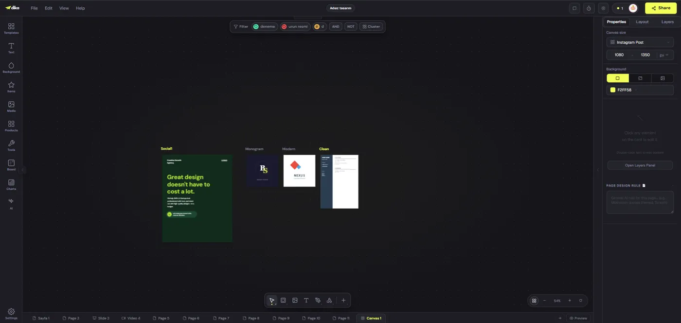
An infinite scene can display multiple editable frames side by side. A board can hold the rough narrative and reference links. Use the board for early reasoning and the scene for production, then label each frame by channel and status. A campaign may also use separate pages if the team prefers that layout. What matters is that related assets are discoverable and their version relationships are visible. Do not mistake a frame labeled “story” for an export checked on a phone. The infinite canvas article</a explains the distinction between planning and framed design.
Build a strong source design
Start with one format that forces a clear hierarchy. A square feed post is a practical first pass for this example. Place one headline, a product-screen crop, a subtle brand cue, and the CTA. Check that the screenshot remains recognizable at mobile size. Do not use a tiny interface image simply because the full dashboard looks impressive on a large monitor. If the product screenshot is too detailed, focus on the one element that supports the message. Keep a safe margin around essential text and the logo because other formats will require adaptation.
Use the brand palette deliberately: one dominant surface, clear text contrast, and a restrained accent for the action. Keep the type system small. The design should still make sense without motion or animation. Dika Studio’s editor supports text, shapes, images, and page properties; a template can provide a starting layout, but replace placeholder content and inspect every object. The current social-post tutorial describes copying brand colors and logo into page designs manually rather than assuming a universal one-click brand push for every page. That small detail matters if the team expects a template to enforce brand compliance automatically. See the social-post tutorial for the current editor steps.
Adapt rather than stretch the design
Duplicate the source design, then resize the copy for the next target. In a standard page workflow, resizing changes the canvas dimensions but does not automatically reflow every object. Move and resize elements by hand. A story format has more vertical room but less horizontal width, so a two-line headline may become four lines. A wide professional-network post can show more context but may place the CTA too far from the focal image. Keep the product screen large enough to remain credible, and check that the logo and any disclosure survive each crop.
Use a review matrix for the three variants. The square post should pass at feed preview size. The vertical story should pass platform safe-area checks and allow space for interface overlays. The landscape post should remain readable on desktop and mobile. Treat each as a sibling from one source idea, not as a scaled clone. Dika Studio’s infinite scenes can generate platform-sized copies of a frame, but those copies also require touch-ups. Whichever route you use, inspect the exported result. Our resizing article</a covers what typically breaks when a layout changes proportion.
Write captions and links as part of the asset
A creative file alone is not a complete social post. Write platform-specific captions, the registration URL, and any relevant disclosure in the same review packet. Keep the first sentence consistent with the visual claim. For a story, the CTA may need a short line that fits the platform’s link mechanism. For a professional network, the caption can add context about what the audience will learn. Avoid copying an identical paragraph to every channel if it reads awkwardly or hides the action below the fold. Verify dates and timezone when an event is involved.
Use the exact landing-page URL the campaign owner approved. Add tracking parameters only through an agreed naming scheme, and test the final link. If the walkthrough registration page is not ready, mark the asset blocked rather than inserting a placeholder URL into a scheduled post. Keep captions versioned alongside the visuals. A headline change in the design may require a caption adjustment; a date change certainly does. The asset matrix should show which caption belongs to which export. This is a simple control that prevents a channel owner from pairing an approved image with an outdated paragraph.
Review the whole package
Ask reviewers to check the message, visual, product accuracy, rights, caption, URL, and intended format. Give them the exact version and a deadline. A reviewer who sees only the square design should not be assumed to have approved the vertical story. Record requested changes and the person responsible. When changes are made, show the reviewer what changed rather than asking them to repeat a full review without context. If a product screenshot is replaced, revisit layout and contrast; the change may affect more than the image itself.
Dika Studio’s current pinned comments can hold notes on a canvas, but they are not a live multi-person approval feed. Use a durable approval record for the final decision: version, format, reviewer, timestamp, and scope. The social media approval workflow</a article gives a fuller model. Do not schedule publication merely because the design looks complete in the editor. A missing release, broken link, or unresolved price claim can still block delivery. For wider production support, Dika Design</a connects design decisions with campaign execution.
Compare the outputs before export
Side-by-side review helps the team catch inconsistencies. Are the product name, offer, and CTA identical where they must be? Does the image focus stay recognizable in each crop? Is the event date spelled the same way in visual and caption? Does any variant imply a stronger claim than the brief authorized? Use the table below as a concrete check for the fictional walkthrough campaign. Replace its details with actual platform specifications and brand rules before a real launch; platform requirements change.
| Output | Role | Main visual check | Copy check |
|---|---|---|---|
| Square feed post | Introduce event | Product crop and headline legible in feed | Offer and CTA clear |
| Vertical story | Prompt fast action | Safe areas and mobile readability | Short CTA, correct link placement |
| Landscape professional post | Add context | Balanced screen and text at wide ratio | Benefit wording stays evidence-based |
Check each file after export, not only the source canvas. Inspect dimensions, compression, color, transparency, and whether a font or icon changed during rendering. If a format fails, fix the editable source and export again. Avoid patching a final PNG independently because the project will no longer reproduce the delivered result. Save the export with a clear version and channel name. Include an owner and a checksum or file-size check when files pass through several hands, so the publishing team can identify the exact copy it received. If a platform re-encodes video or compresses an image, inspect the uploaded preview before pressing publish. This protects the effort spent on accurate source design. The Dika Design workflow treats delivery checks as part of production, not an afterthought.
Hand off with an exact delivery record
Prepare a small handoff packet: three exported files, their captions, tested URLs, proposed publish slots, approval record, and source project link. State which person is responsible for uploading or scheduling. Dika Studio’s activity calendar currently records workspace activity rather than planned social posts, so do not treat it as the publishing queue. Use the destination platform or an authorized scheduler for that final step, then open the live posts and verify the media, caption, and link. Record the live URLs in the campaign log.
After publication, compare the outcome with the original brief. Did the team produce assets that communicate the chosen message? Which format demanded the most revision? Was any approval unclear? Those answers improve the next brief-to-asset workflow. A reusable process does not mean every campaign should look the same. It means the team can make creative decisions on a stable foundation, with accurate sources and fewer preventable handoff mistakes. Explore Dika Studio for the editable production surfaces and Dika Design for the broader marketing context.
Frequently asked questions
What should a campaign brief include before design starts?
Include audience, objective, offer, approved proof, channels, deadline, CTA destination, brand rules, and any prohibited claims.
Can I turn one design into several social formats?
Yes. Duplicate the source page or create frame variants, then adapt each layout and inspect the result. Resizing does not automatically solve every crop and text problem.
Should every platform use identical creative?
Keep the core message and approved facts consistent, but adapt composition and caption to the channel and placement.
What source assets should be checked?
Verify product imagery, logo, brand styles, releases, usage rights, customer quotations, and any screenshot that could expose private or unfinished information.
Does Dika Studio automatically apply a brand kit to every page?
Do not assume a universal one-click brand push for every page. Check the current editor workflow and apply colors, typography, and logo deliberately.
Can an infinite scene help with a campaign set?
Yes. It can show several editable frames on one canvas, which helps compare related formats and variants.
What belongs in a social post review packet?
Include the exact visual version, caption, CTA, destination URL, platform, format, proposed date, rights status, and reviewer decision.
Is a Dika Studio activity-calendar entry a scheduled post?
No. The current calendar records workspace activity rather than a queue of planned social posts.
What should I verify after export?
Check dimensions, crop, legibility, fonts, transparency, compression, and whether the file matches the approved source design.
When is the brief-to-asset workflow complete?
After the correct files and captions are approved, handed off, published on the intended platforms, and checked at their live URLs.